
We also accept payments via Paypal
Huri Translations
Tel. +689 89 205 483
info@huri-translations.pf
PO BOX 365 Maharepa
98728 Mo'orea
French Polynesia
N°TAHITI 876649
Subscribe to our newsletter

1
Polynesian branding case study #1
THE STORY
Client project & needs
Kali and his Polynesian family and friends in California were in need for a special identity for their cultural association.
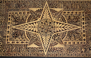
In fact, Kali had a piece of traditional bark tapestry called "Ngatu" which his Tongan grand-mother made for him.
Kali wanted to use the piece of ngatu as the base of the logo.
THE WORK
Brand name construction
Name structure : Classic descriptive name construction.
Design
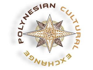
As the original Ngatu patterns are way too intricate for a logo, we extracted the core of the design.
Content representation
The star shape has four branches and four sub-branches.
It represents the compass rose, with the main winds the seafaring Polynesians used in ancient times.
Colors - The earth tones remind of the soil of the Pacific islands
Font - The team wanted to give a modern twist to the logo to represent the younger generations and encourage intergenerational exchange among Polynesians.
CASE STUDY
2

THE STORY
Client project & needs
A brilliant businessman, our client wanted to give his new company a Marquesan identity.
He has a passion for hunting and loves his valleys of the Marquesas islands, where wild boars and goats can be found.
The entrepreneur called upon Huri Translations to build his entire brand identity.
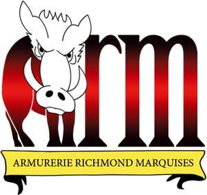
The acronym ARM stands for Armurerie Richmond Marquises, which astutely forms the word ARM.
Our client made the point of representing the Marquesas islands by using the red, yellow and black colors that make up the Marquesan flag.
THE WORK
Brand name construction
Acronym structure : A + B + C
Language combination: French & English
Armurerie = Gunsmithery
Richmond is client's surname
Marquises = Marquesas
Design
Content representation
The boar - Letter A is shaped into a boar to conjure up boar hunting.
The reddish color announces game tracking and blood. The banner represents a trophy.
The metallic colors suggest gun metal.
Long font feet remind of rifle barrels.
CASE STUDY
Polynesian branding case study #3
Polynesian branding case study #2
THE STORY
Client project & needs
On the biggest Internet social network, we met our client Mayra from Mexico.
She loves Tahitian dance and decided to create a Tahitian dance group of her own.
She wanted a creative approach in the branding of her company.
Mayra had in mind broad ideas like "sweet dawn" or "rising sun" for her company brand name while she sought for a logo set in a very Polynesian theme with representations of the elements of Nature.
THE WORK
Brand name construction
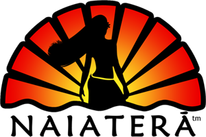
Morphemic structure : NAI + A + TE + RĀ
Morpheme descriptionnai = dancer(s) a = possessive preposition te = demonstrative pronoun rā = sun
Phonetic realization : [naiatera:]
Every phoneme fits with the Spanish phonemical systemSpanish translation : Bailarinas del sol
Design
Content representation
The sun - Light is concentrated on the dancer's waist to highlight hip movement
The wind - Windblown hair brings a dynamic aspect to the design
The sea - The waves are a connection with the islands
The flower - The discreet shape of the tiare Tahiti behind the ear reminds of Tahiti
CASE STUDY
3
